
Websites and search
Make your booking page work with touch and a keyboard
Apple's Touch on Mac guidance is a useful reminder to check your booking page. Test menus, calendars and forms with touch and a keyboard before customers do.
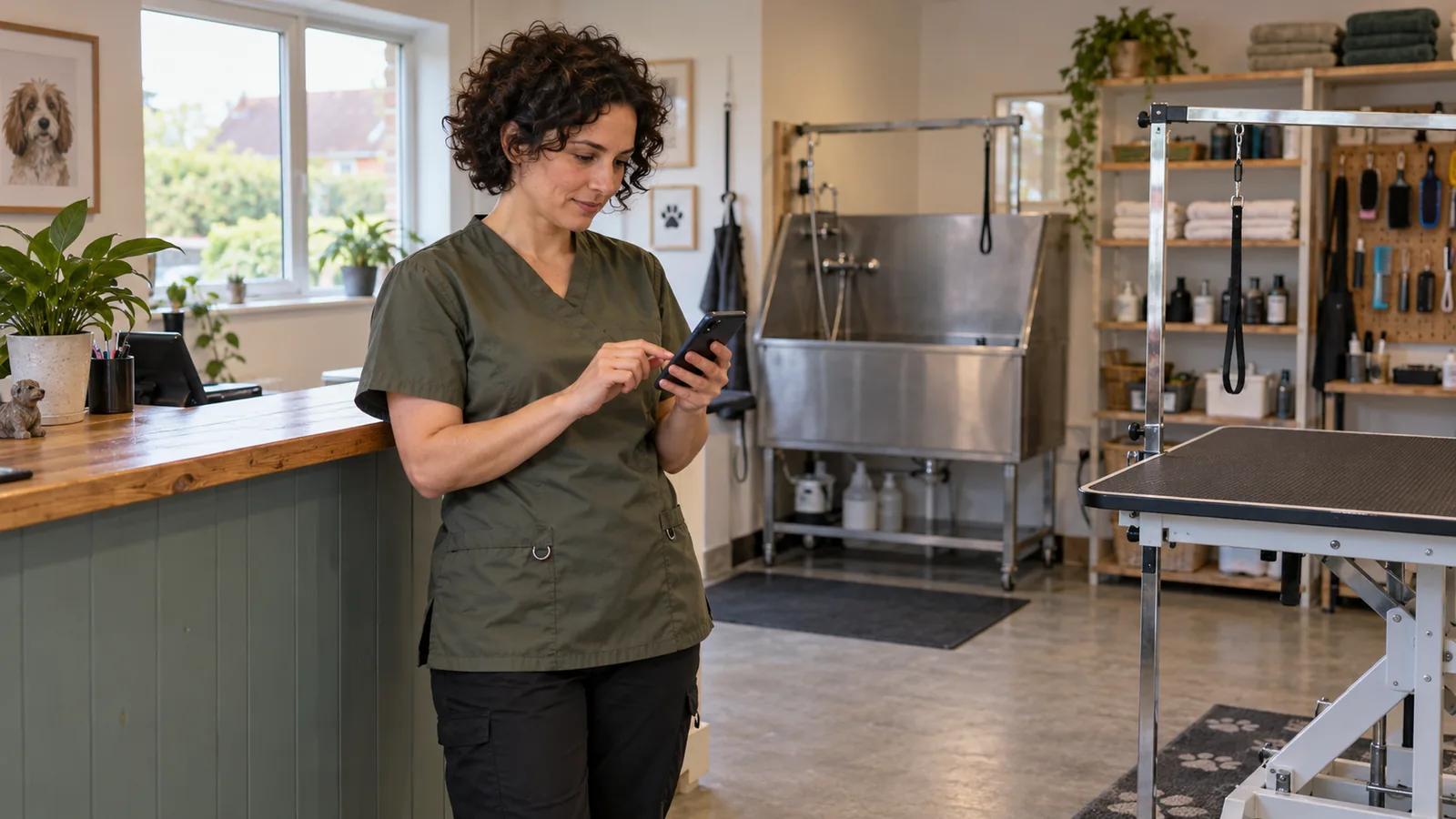
A booking page can look tidy on the owner's laptop and still be awkward for a customer. Imagine someone trying to book a dog groom on their phone: a service description only appears when a mouse hovers over it, the calendar has small controls, and an error sends them back to the start. The useful test is whether they can finish the booking with the device and input method they use.
What changed this week?
On 28 October, Apple published developer guidance for Touch on Mac. We reviewed it on 30 October. It offers a timely reason to revisit an older website-design question: are we assuming that everyone uses a mouse?
Apple is helping developers prepare Mac apps for touch
Apple's announcement directs developers to design and implementation videos, Group Labs and resources for preparing apps for MacBook Pro with Touch. The resource page includes material on gestures and pointing devices.
These resources concern Mac apps. Our interpretation for a small-business website is more modest: review the customer journey across input methods. The announcement does not mean that every website needs a redesign, or that a touch-friendly page will automatically increase bookings.
Apple Developer: Get ready for Touch on MacAnnounced 28 October 2026; reviewed 30 October 2026
Keyboard access is already established guidance
W3C's explanation of WCAG 2.2's keyboard criterion says functionality should be operable through a keyboard interface, with a specific exception for functions that depend on the path of a movement. It explains that keyboard interfaces support people using a range of assistive technologies as well as conventional keyboards.
This is existing guidance, not a new requirement created by Apple's announcement. For ordinary booking tasks, it is a useful starting point for checking how someone reaches and operates each control.
W3C: Understanding keyboard accessibilityExisting guidance; reviewed 30 October 2026
What could this mean for a small business?
Consider an illustrative dog-grooming salon. A customer needs to compare services, select a suitable appointment, enter contact details and receive confirmation. The salon may control its service pages while a separate provider supplies the booking form. The handover between those two parts deserves a test of its own.
On a phone, try reading the service information and selecting an appointment without accidentally choosing the next date or time. Check that a menu opens with a deliberate tap and can be closed. Important information should be available through a clear, usable interaction.
Then try the same journey with a keyboard. Can you tell which link or field is selected as you move through the page? Can you open the calendar, choose a date and leave it again? Note the exact point where progress becomes difficult. This is an illustrative review method, not a finding about a particular salon or booking provider.
Hover content needs careful handling
W3C's guidance on content appearing on hover or focus addresses whether people can dismiss it, move the pointer over it and keep it visible long enough to use it, subject to the criterion's stated exceptions. It notes that temporary content can be difficult to perceive or dismiss.
For the salon example, our preference would be to place essential service details in the page or behind a clearly labelled control that works across input methods. Ask the developer to review any tooltip or expanding menu that contains information needed to make a booking.
W3C: Understanding content on hover or focusExisting guidance; reviewed 30 October 2026
Make completion part of your website review
A visual review is useful, but add a short task walkthrough whenever an important form, menu or booking service changes. Keep the task specific: book one appointment, request one quote or change one existing booking. Record the device, browser and input method so another person can repeat the check.
Include a mistake in the walkthrough. Leave a required field empty or enter an invalid date using test details. Check whether the explanation identifies the problem, whether the person can reach the field and whether information they already entered is preserved. Use a preview or test booking where available so the exercise does not create a real appointment or charge.
If a third-party widget causes the problem, send the provider a concise description of the steps and the expected result. Ask which settings or supported alternatives are available. A replacement may be worth considering if an essential task remains unusable, but first establish whether the current implementation can be corrected.
Over time, keep a small set of representative tasks as part of routine release checks. Include feedback from people who use different input methods where possible. A quick walkthrough can reveal practical obstacles; a systematic accessibility review should examine the wider experience. Neither should be reduced to a promise that one change will deliver a particular commercial result.
What can you do this week?
Choose your most important booking or enquiry page and set aside time to complete these five checks. Record problems as specific steps someone else can reproduce.
- Follow the whole journey on a phone. Start from the service page and check the menu, service details, calendar and confirmation using touch.
- Repeat the task with a keyboard. Check that the selected control is visible, the order is understandable and you can enter and leave each interactive area.
- Review hidden information. Look for prices, explanations or options that only appear on hover, and ask how a touch or keyboard user reaches them.
- Try a recoverable mistake using test details. Check that the message explains what to fix and that correcting it does not unnecessarily erase earlier entries.
- Assign and recheck the fixes. Separate changes your developer controls from issues with the booking provider, then repeat the affected task after each correction.
How Context Aware can help
We can review the path from a service page to an enquiry or booking, identify unclear controls and improve the parts of the website you own. That can include navigation, form layout, keyboard behaviour, useful error messages and the handover to another service.
We can also help turn a vague complaint such as 'the booking form is difficult' into a reproducible issue for your provider. Bring us the page and the task customers need to complete, and we can work through a practical first improvement. Where a fuller accessibility assessment is needed, we can help define that scope clearly.
A note on the sources
We reviewed Apple, Hacker News, OpenAI, Anthropic, Mistral and Google Search Central during topic selection. This article focuses on Apple's developer announcement and established W3C guidance. Direct access to Mistral's X profile was blocked, and targeted searches did not yield a verifiable current discussion relevant to this article. No conclusions rely on X reactions.
Prepared by Context Aware with AI assistance and linked primary sources. Examples are illustrative. How we write our insights.